


Communication is the imparting or exchanging of information by speaking, writing, or using some other medium.
I once spoke with someone who has a hearing and speaking impairment. It was quite the conversation as neither of us understood the others language, she was speaking with signs while I spoke with words. At the end of the day, no information was exchanged and so communication never took place. I used to believe that good user interface was something that looked “cool”, but it is more than simply looking interesting or cool. Design is communication. It covers all the process involved in how the Interface helps the user navigate through the app or website without difficulty. A good User Interface is what makes a 'Seamless Communication'. In a seamless communication, there is no barrier to communicating or navigating through a network.
Design has a lot to do with real life experiences and how we perceive things in the real world in comparison to the digital world. The only difference here is the interactions are done on screens by swiping rather than face to face.
This article focuses on highlighting a few communication tools UI designers should pay attention to when designing.
1. Buttons:
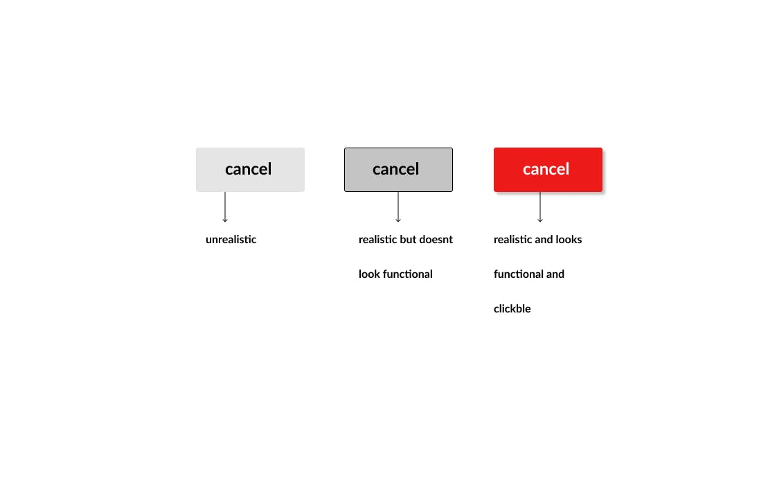
This functions just as real life buttons would function, the only difference should be the digital screen. It is the designers job to make this as realistic as possible by making it look functional and clickable as it would in the real world by adding shadows, colors and a text that tells what action the button performs.
2. Place holder text:
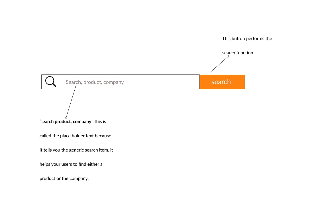
Can be referred to as dummy text or filler text. They temporarily "hold a place" in a document for the purpose of typesetting and layout. Designers use placeholders to tell the users, what to insert in the ''place''. The popular 'Lorem Ipsum' is also a place holder or dummy text most UI designers use in their design, before sending it to the UX writer to fill the proper text. This is important in any place where there has been an upgrade and the user may not be familiar with it just yet, or this is the first time a user comes in contact with your website or mobile app.
3. Colors:
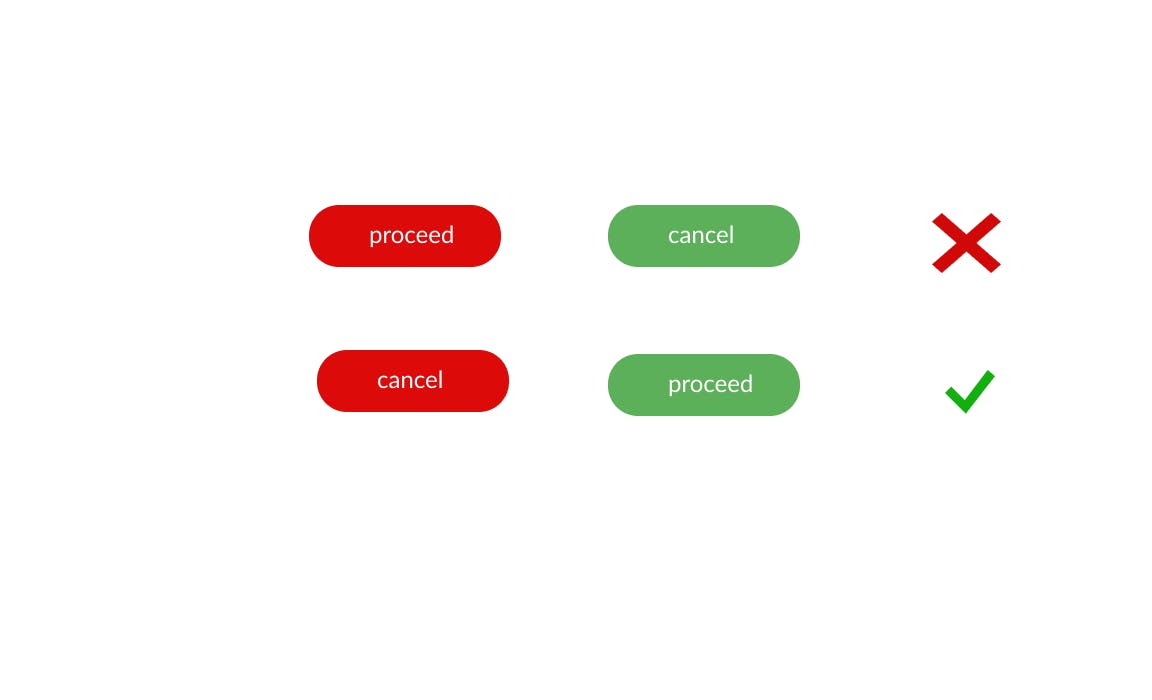
There are several colors in the real world that users are already familiar with that can also be applied in the digital world to ensure uninterrupted communication. 'Red' for instance denotes danger, end and stop. 'Green' means Go, continue, proceed etc. In the digital world these could be used to communicate with the users, it can be used on buttons or texts to tell the user to exit the app, cancel a transaction, proceed to the next etc. Note the color and positions of the button may also affect the users interaction with the product. If the color must be touched, the position and text should fit appropriately.
4. White Space:
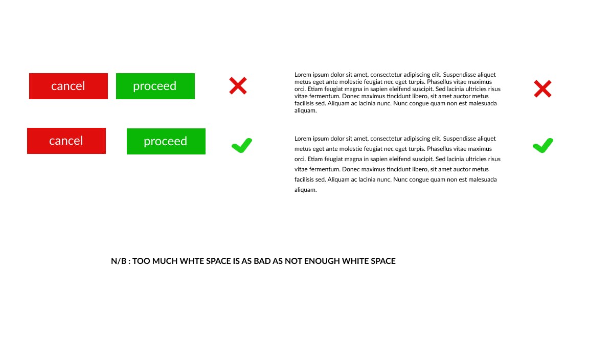
Consider spacing and size of buttons when designing, some users have larger fingers so the proximity of objects on the design can affect the communication process between the user and interface. We don't want our users clicking on proceed when they want to cancel, or not able to read a text, because of its closeness to the previous line or text. note: Too much white space is also as bad as not enough white space
5. Iconography:
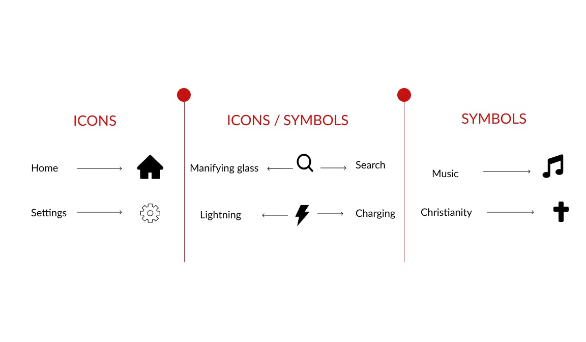
One of the things that people often get confused with is the difference between an icon and a symbol. Part of this reason is why
we tend to use the word icon for both symbols and icons, Both of them represent other things. It shows us a visual representation of the object that is relatively realistic compared to what the object is. An icon is pictorial while a symbol is not (although some icons also act as symbols). If we're talking about a concept, something as abstract as thought for instance, it's quite hard for you to think of an image of that, so we have to create a symbol to represent that concept or that idea. As a designer it is our job to use icons and create symbols that are easy to understand by the user and in no way disrupts communication. Do not use abstract icons that are not familiar with the users. (we don't want our users getting lost or confused, now do we?)
6. Walk throughs:
They are really important and serve as good user experience. They are pop up messages that guide a first time user through the interface by helping them navigate easily through the interface. Hashnode has a good "walk through" for first timers.
Conclusion:-
Design isn't just what looks beautiful or aesthetically pleasing, Design is what works. Sometimes little design is good design enough as long as it is workable, engaging and interactive. A good designer never confuses the users. Be a good designer today! (smiley face)